Project dates: July 2019 – December 2019
Roles: UX, UI, Front-End Dev
Product website: http://teamtonic.com
I was called to partner with the team of developers at Done. to work on a project for a company called Boostalab. My role was initially to provide UX guidance, complete UI work based on initial mock-ups, and contribute to the front-end web development work using Angular 2.
The project’s vision
The idea behind the product Boostalab wanted to build was to enable and facilitate personal growth within a workplace, with a combination of introspection and support from your peers to evolve through your hurdles towards a common goal that would benefit the team, and therefore, the business.
Goal for the MVP release
When the mock-ups were presented to me, they informed me of their main initial goal: have a ‘wow’ factor when they showcase their new product at a conference that was happening 10 weeks from the project kick-off date.
My experience
Onboarding
I was on-boarded on time for Sprint 1, which meant that I had missed the preparation that comes during Sprint 0 in an Agile development environment.
While I was asked to join the team because of my UX background, I was not asked to re-do the UX of the initial mockups, and therefore tried to jump right into developing components of the first sprint’s user story.
I found the structure of the page difficult to break down hierarchically, so by the end of the first week, I raised a question that made Boostalab understand the importance of my understanding of their end goal: “What am I coding, here?”
Reshuffling
In an attempt to get me on the same page as everybody else, Boostalab organized a work session with me, which was meant to summarize the outcome of Sprint 0, but soon after we started talking about the project’s goals, I raised my concern about their initial mock-ups:
- It’s not obvious what the user is supposed to interact with
- It’s unclear to me what is meant to be a compelling reason for users to keep coming back to the app
- Given that the app is meant to support a team through individual growth, I felt two very important aspects were missing:
- The concept of teamwork
- The concept of moving forward, evolving, succeeding (or not)
We then called a halt on the front-end development while I sorted out the new user flows that would incorporate the missing aspects, and we had to evolve the product a few times before we were able to fully integrate the concept of teamwork.
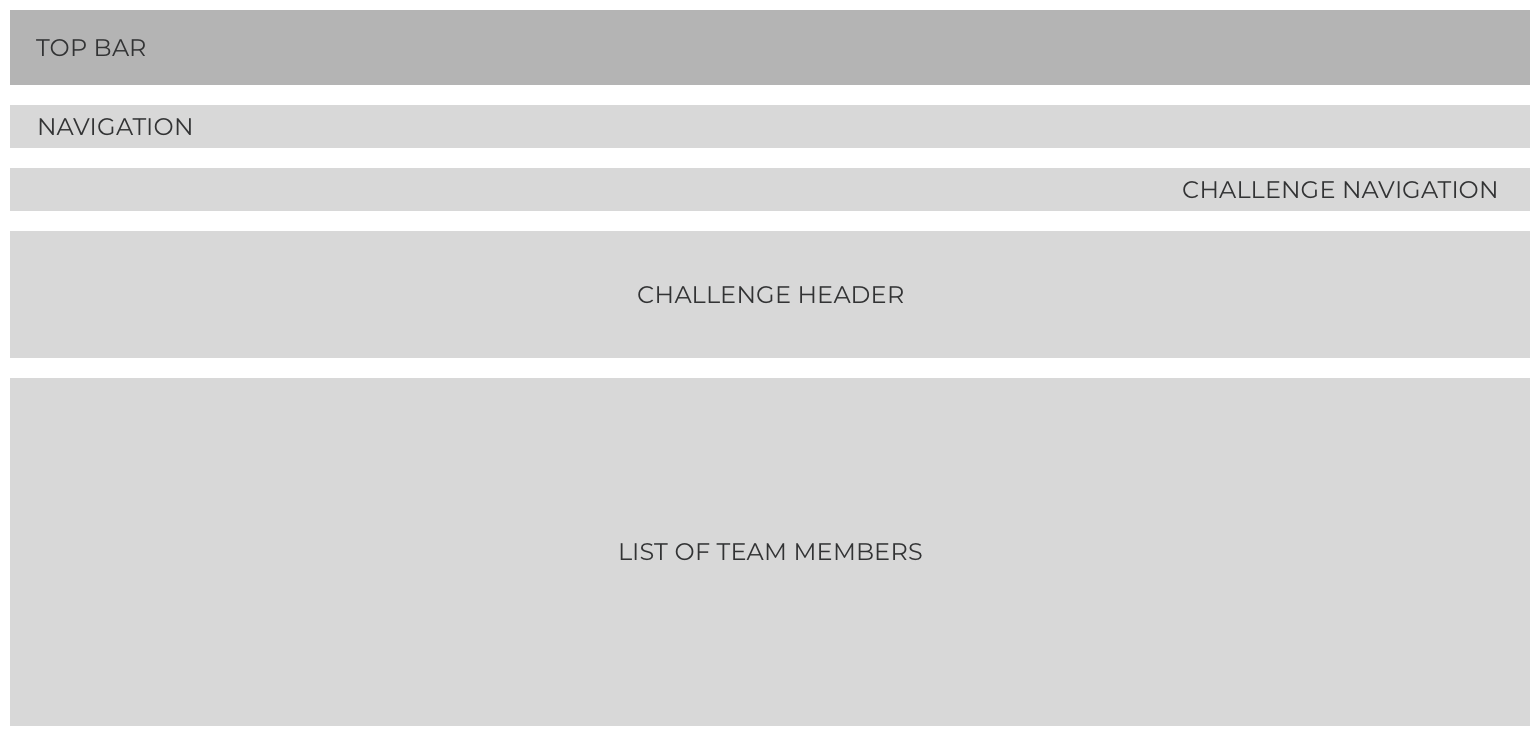
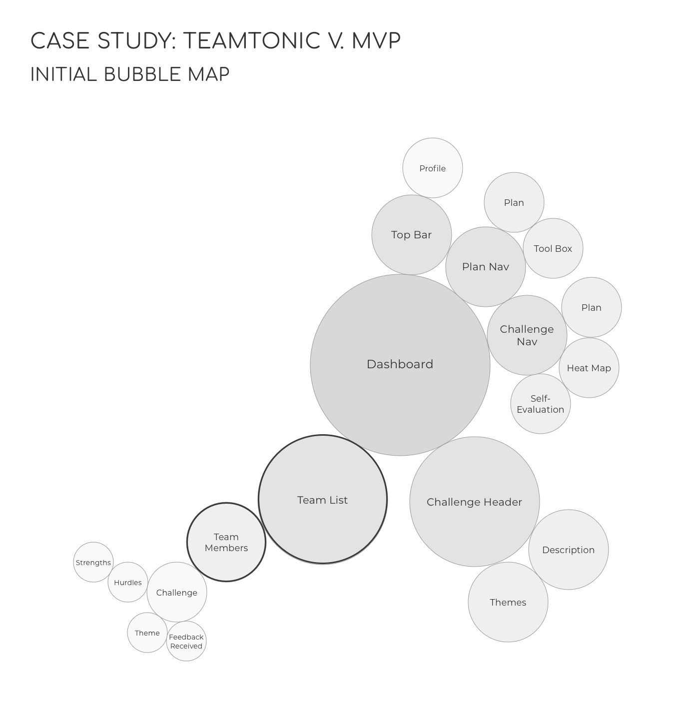
The first change re-organized the content hierarchy:

A section dedicated to information regarding a plan (Plan Header) was added above the challenge header as it was referred to a lot during my discussions with Boostalab as the guidepost against with each challenge are based off.
My Challenge was supposed to be where the user can change edit their own information, and My Stats was supposed to display a graph that would show how many thumbs up the user received throughout the weeks, but we removed the concept of showing the thumbs up per week in a graph by fear that showing a graph that goes would affect a user’s self-confidence.
The second change added more interactions with the web app:
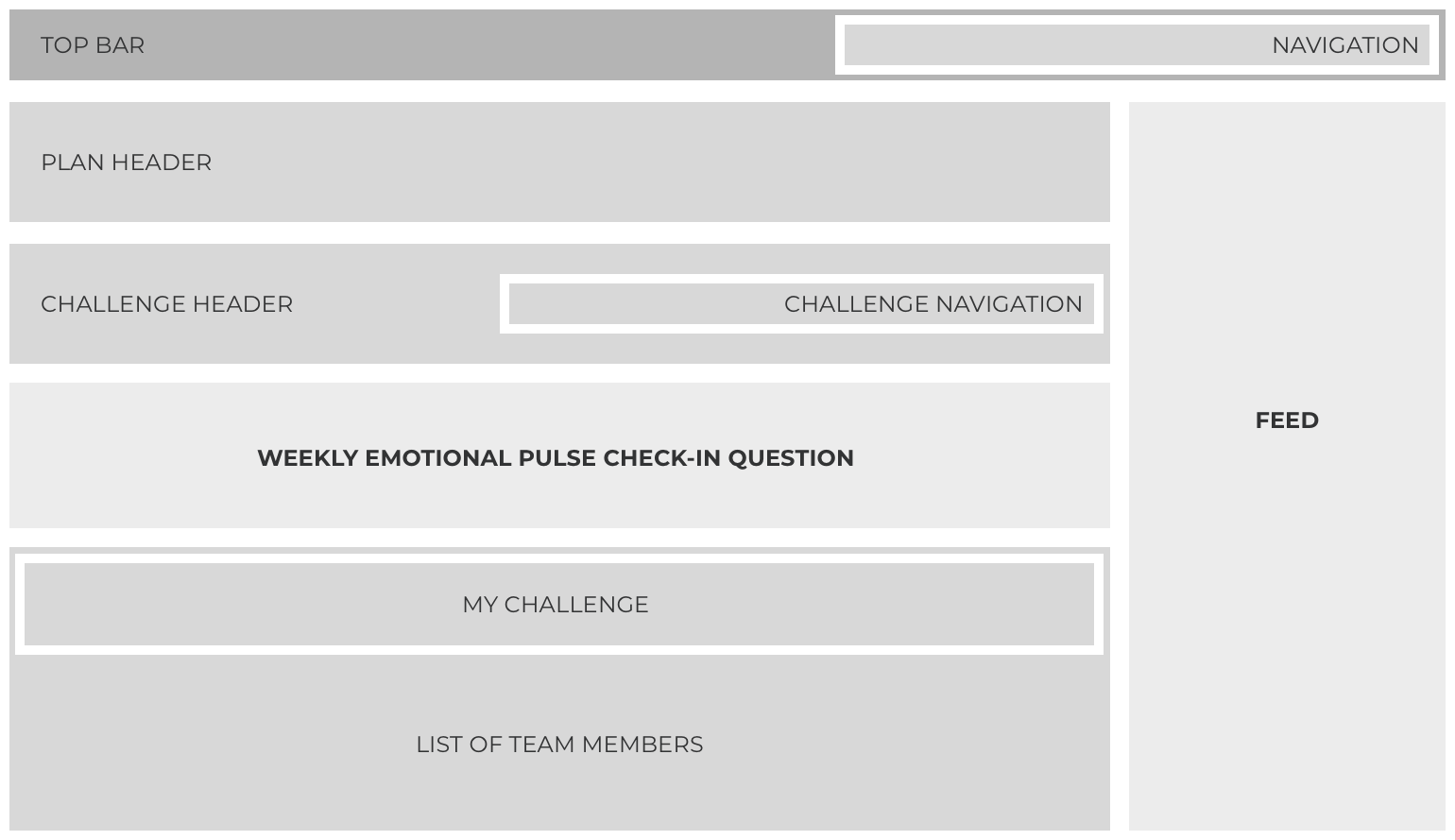
The Weekly Emotional Pulse Check-In Question was meant to ask the user how they are feeling, on a weekly basis, as a means for the team to know how their colleagues are doing. During this round of change, the concept of Feed – that had been carefully studied and discussed during Round 1 – finally showed up, meant to display the exchanged thumbs up throughout team members as well as their answer to the Emotional Pulse question.
The third round of changes incorporated more features around the concept of teamwork:
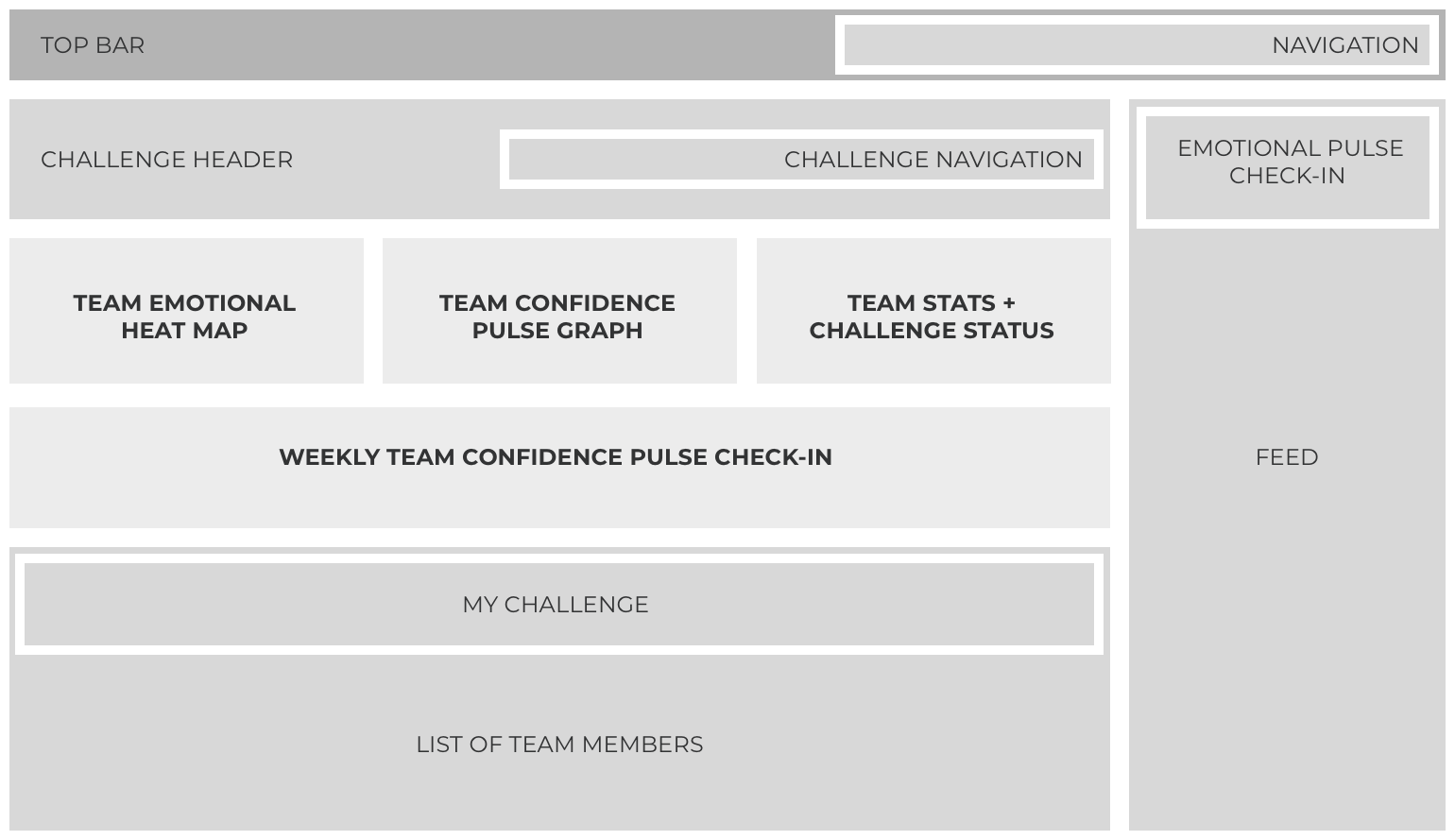
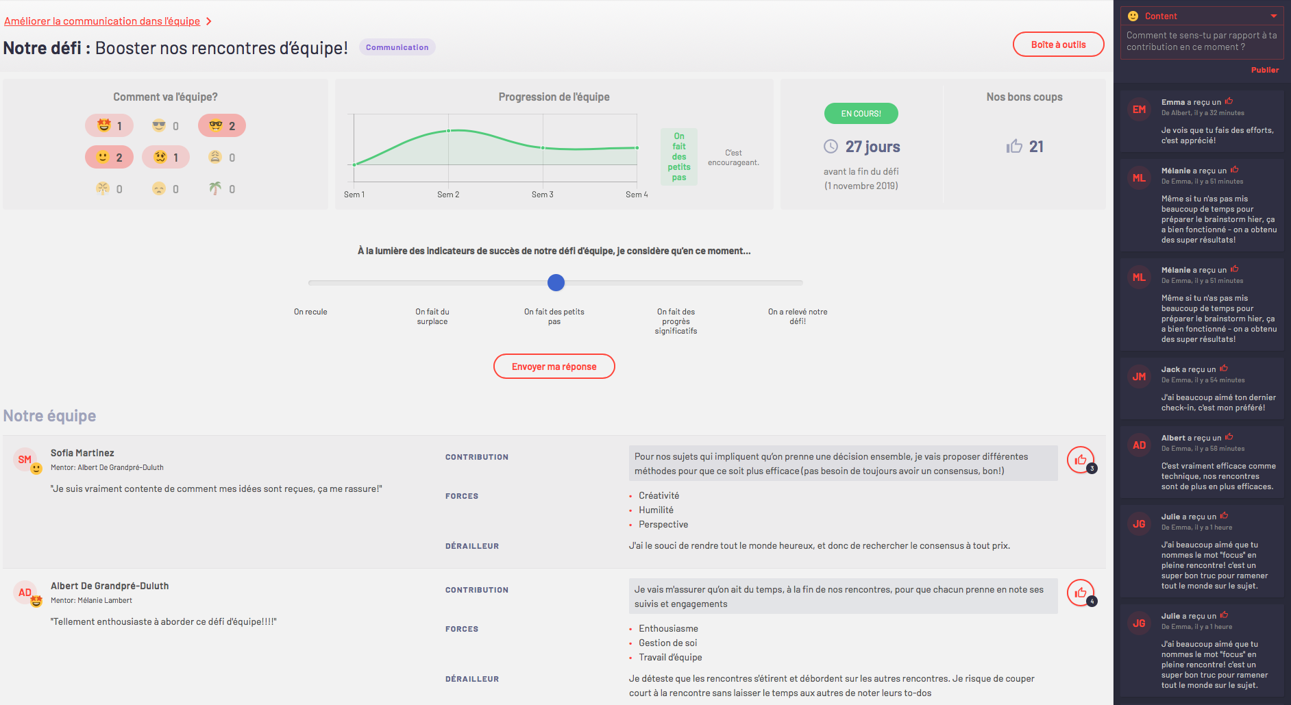
To show a better idea of the team’s topography regarding the challenge, the last round moved the Emotional Pulse question into the feed, and the concept of it being a weekly question was completely scrapped to let the user share their emotions whenever they arise, if they feel like doing so. Instead, it was replaced by a Weekly Team Confidence Pulse Check-In, meant to see if the team feels like they are progressing through their challenge. Stats were also added: Team Emotional Heat Map to display the mood of the whole team, Team Confidence Pulse Graph to display the team’s average answer to their Team Confidence question, and Team Stats, to display the total team thumbs up exchanged.
The sum total of the changes resulted in:
- Less importance to the list of employees within a team
- A feed for users to see updates on their peers
- A way to leave feedback alongside a thumbs up to a peer
- The weekly questionnaire to assess how the user is feeling about their individual goal became two separate features:
- The possibility to share a feeling (with an explanation), with the emotions of the team displayed as a heat map to easily feel how the team is doing
- A weekly 1-click answer question that asks how confident the user is that they are evolving towards their goal and over their personal hurdle, with answers translated into a graph to see the level of confidence evolve through time
Outcome
The end result of this first release was a web application that was much smaller in features, but the features deployed had more depth; more reasons to exist. Workflows were more streamlined, guiding users through their tasks instead of letting it feel like a blank canvas where anything was possible.
My Roles
UX Design
The UX design experience I had through this project included a lot of guidance for the client through their choices, in terms of feature priorities and development phases.
UI Design
I was initially asked to prepare for a white label kind of approach to designing the app, and that’s why most of the app is muted in terms of colors. As the project evolved, the idea of white labelling the product became much less significant, and additional colors were welcomed into the scheme, which I kept vibrant and soft, to make the colorful elements visible but not aggressive.
Front-End Development
As support to the full-stack developers, I was asked to work on the HTML and CSS, using Angular. Amongst the tools used with the developers were Azure DevOps, Slack, Zoom and Invision, in an Agile environment.
Date published: March 18, 2020